For Kenyan motorists, the problem is not a confusing abundance of road signs and markings, but a lack of them.

Motorists are supposed to know the meaning of all traffic signs. How many are there?
Many thousands. But all belong to just three different types:
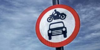
1) Circular signs give orders
2) Triangular signs give warnings
3) Rectangular signs give information.
If a circular sign is solid blue, it is telling you what you must do. If it is white with a red ring it is telling you what you must not do. All triangular signs are white with a red border. The colour of rectangular signs indicates the status of the road you are on – generally blue for “motorways”, green for primary routes, white for non-primary.

Being able to recognise and interpret every sign is thus not a formidable feat of memory.
Armed with that short and easy-to-remember knowledge of each “type” of sign, the graphics and wording are usually self-explanatory (unless you thin a red triangle with the silhouette of a running sheep means "no ewe turn".) Being able to recognise and interpret every sign is thus not a formidable feat of memory – even when several shapes and colours are used in combination, either on a single board or all attached to the same post (each component of the sign “should” comply with the shape and colour protocols of: must do, do not do, look out, which way, and what’s what.
There are also many, many different road markings with specific and different meanings (many dozens) and an increasing number of electronic signs, bollard arrays, roadworks diversions (usually yellow) and so on.
For Kenyan motorists, the problem is not a confusing abundance of signs and markings, but a lack of them. Those that do exist are not infrequently makeshift or in the wrong place, or the wrong size. Happily, the current trend in our road signage is progressive improvement.
The business of ordering and erecting signs might be delegated to counties and councils, but for obvious reasons the standard must be national…and preferably international. As the signs themselves improve, so will public knowledge, attention and compliance. In this, as in many other ways, good and safe traffic flow depends on two-way competence and respect between administrators and users.
Each country also has its own unique issues, and might need to “invent” some signs to address these. One glorious Kenyan example is “No Overlapping”. I don’t think this is on the international list, but it is a perfect descriptor of the Kenyan habit of turning restricted flow into no flow at all by forming five queues side by side on a two-way road, log-jamming the verge and the oncoming lane. The conventional “no overtaking” would be inappropriate and misleading. No Overlapping is perfect…and would be even more effective if accompanied by firing squads (armed with paint guns).
Our most conspicuous shortage is in direction and place-name signs. Any stranger would need to have a GPS map to find their way around.

Different road signs.
Temporary signage for diversions and roadworks is the most sub-standard, often using bent oil drums and hand-written cardboard. Though most essential in the dark, they have no lighting or reflective luminosity. They are rarely signalled in advance with “Road Works 200m Ahead”. They are placed in “Here” and “Now” locations for vehicles approaching at up to 100 kph, perhaps with high-sided trucks obscuring the view.
The likely speed of ambient traffic is of course vital to determine the height and size of signs required. A classic (though not unique) example was the multi-lane exit gates of JKIA, which required vehicles to get in the right lane (for pass holders and ticket payers) in advance. Without a pair of binoculars, the lane labels at the gate were too small to read from the point where the choice of channel had to be made.
We have a lot of very large advertising billboards (often blocking or despoiling the view of a landscape in which we take pleasure and national pride). Marketing firms know how large their message must be to get noticed and read by traffic passing at speed. On major routes, that is how big the smallest directions signs are in many parts of the motorway world.

The colour of rectangular signs indicates the status of the road you are on – generally blue for “motorways”, green for primary routes, white for non-primary.
The biggest motorway signs are the size of three-storey buildings, with powerful overhead lighting. Where advance lane selection is imperative, they are on overhead gantries, hundreds of metres before the decision is urgent.
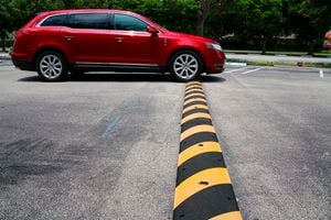
Road marking anomalies are too numerous to list here. If I had to pick the single most important, it would be the absolutely mandatory painting of speed bumps. Any that are not made and kept brightly and unmissably visible should be removed.